We noticed that there wasn’t an app in Spain that made it easy for people to borrow or lend tools, and we thought, “Why not fix that?” That’s how Clavoo was born! It’s the first app in the country designed to help people to share tools with their neighbors and community.
Clavoo Tool Sharing App
.png)
Software used: Figma, Sketch, Miro and Photoshop
My Role: UX Design, UX Research
Problem
I wanted to solve a problem lots of us have faced: needing a tool for a quick job but not wanting to buy it because it’s expensive, takes up space, or you’ll hardly use it again. On the flip side, there are plenty of people who own tools that just sit around collecting dust. The aim was connecting these two groups, making it easy to borrow or lend tools when you need them!
_edited.jpg)
Solution
The app will help neighbors to lend and borrow tools with ease. It’s a win-win: you save money, cut down on waste, and build connections with people nearby. The app is super user-friendly, with a big tool database, ratings and reviews to keep it honest, and secure transactions for peace of mind. Plus, by sharing instead of buying, you’re doing your part to live more sustainably and reduce unnecessary consumption. It’s not just about tools—it’s about building trust, saving resources, and helping the planet.
Research
Online Survey and Empathy Map
The main aspects gathered from the online survey and summarized onto the empathy map were that Clavoo’s main users would be mostly city-dwellers aged 25-44. While many already own common tools like hand tools, painting tools, or gardening tools, 20% don’t own any tools at all. People have mixed habits when it comes to lending or borrowing—some do it often, while others rarely or never do. In terms of the biggest concerns:
The top worry? Trust:
-
80% of users are concerned about how trustworthy other users are.
-
70% worry their tools might get damaged or lost.
What users want:
Users shared must-have features that make the tool-sharing process smooth and secure:
-
Core Features:
-
Ratings and reviews for trustworthiness
-
Tool availability calendar
-
In-app messaging for easy communication
-
Price listings
-
Tool status updates
-
-
Smart Notifications:
-
Alerts for new requests, due dates, availability, and messages
-
Customizable notifications
-
Extra features they’d love:
-
A way to search and filter tools
-
Clear pictures of the tools
-
Details about the tool’s condition


User Persona
To better understand our target audience and design a user experience that truly meets their needs, we created a user persona based on the insights from our research. This persona helps bring the target user to life, making it easier to empathize with their goals, frustrations, and preferences throughout the design process.
Meet Oscar! He’s 34, lives in Seville, and works as an HR Coordinator. He’s into DIY projects and enjoys fixing up and decorating his home. While he owns a few tools, he’s all about finding trustworthy people to share tools with. He’s decent with tech and values features like user reviews to feel confident when borrowing or lending.
Having Oscar as a reference point keeps us focused on designing features that solve real problems for users like him, ensuring Clavoo is intuitive, reliable, and helpful.

Design
Interaction Design
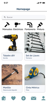
After completing the research and analysis phase, I moved onto the designing phase. I started by sketching the initial ideas on paper, before starting to design them in Figma. This is the outcome and below that I show step by step the decisions that I made prior to start sketching with images from my prototype in Figma:

Here are the key design decisions based on the pain points discovered earlier:
-
Interaction Design: I focused on easy navigation, a clear layout for tool listings, and a simple process for lending and borrowing. I also made sure to include features like user ratings and messaging to enhance communication.

.png)
-
Trust & Security: I added a solid rating and review system to help build trust in the community. I also included detailed tool status updates and specifications about their condition to give users peace of mind when borrowing or lending.


-
Search & Filters: To improve the user experience, I added advanced search and filter options, allowing users to quickly find tools based on type, condition, and other important details.

.png)
-
Visual & Informational Elements: To ensure transparency, I included high-quality images and clear specifications for each tool, helping users assess their condition and decide if they’re right for their needs.

Prototype
Continuing from the research and design process, the final prototype acknowledges that Clavoo will be the first tool-sharing app in Spain. My design keeps in mind local habits and user expectations, using familiar concepts to make the platform intuitive and easy to navigate. To bring this to life, I created a detailed prototype in Figma, where I simulated a real user experience. Along the way, I incorporated feedback from others, which pushed me to refine the design further. This process helped me to ensure the prototype could effectively represent the user experience and provide valuable insights for testing and improvement.
Conclusion
After finishing the design of the Clavoo prototype, I conducted usability testing to see how users would interact with it and to identify areas for improvement. The goal was to make sure the app was easy to use, intuitive, and met the needs of the target users. The testing gave me some great insights that helped me refine the design even more. Here's what I found:
Key Findings from Usability Testing:
-
CTA Button Hierarchy: The buttons weren’t always placed in the most intuitive way. I had to make sure the important actions were more visible and easy to find.
-
Need for Feedback: Users wanted more confirmation when they took actions in the app. Things like notifications, status updates, and confirmations would help them feel more confident using it.
-
Tool Status and Availability: Users needed clearer info on whether tools were available and in what condition. This helped give them peace of mind when borrowing or lending.
-
Navigation Tweaks: Some areas of the app needed minor changes to make navigation smoother. The goal was to make lending and borrowing as simple as possible for users.
After making these adjustments, the final design presented in the previous section on this page, felt much more polished and user-friendly.