
SkyNest
As part of my Professional Diploma projects at the UX Design Institute, I worked on a use case for an airline desktop platform called Sky Nest. The goal was to improve the online booking process to better meet the needs of modern travelers. In this project, I took on the role of UX Designer and Researcher.
Software used: Figma, Sketch, Miro
My Role: UX Design, UX Research
Problem
The main problem is that airline websites often make it hard to find clear info about seats, luggage, and the final price. This leaves users frustrated and confused while booking. On top of that, there are too many distracting elements that make it harder to focus, and some people give up on booking altogether. All this confusion and distraction lower user confidence and make the experience way less satisfying. It’s clear there’s a need for a simpler, clearer, and more user-friendly booking system.
_edited.jpg)
Solution and Goals
To fix these problems, the main goals were to make things clearer, simplify the booking process, and cut out distractions. The idea was to show all the important details—like seat options, luggage rules, and final prices—clearly at every step. I also focused on cleaning up the interface by removing unnecessary clutter to help users stay focused.
Research
To really understand user needs and industry standards, I used competitive benchmarking, online surveys, and usability tests.
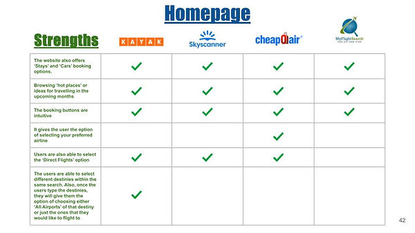
Competitive Benchmarking
Through competitive benchmarking, I identified key user expectations and areas for improvement in airline booking websites that already exist. Users expect simple search options (locations, dates, traveler types) and clear results with final prices, flight details, and easy filtering.
To enhance the experience, I suggested adding features like multi-city bookings, direct airline links to avoid extra fees, “explore everywhere” options for undecided travelers, and clear baggage and cancellation info. Filters for cheapest, quickest, or best flights, along with save-for-later options, were also priorities.

Online Survey
🔍 Key Survey Insights:
-
9.1% of users are 45-54 → Keep design simple & intuitive
-
63.6% visited an airline site recently, but few booked instantly
-
90.9% successfully completed tasks → Websites are mostly effective
-
63.6% were satisfied, but others were neutral → Improvements needed
-
72.7% sort by cheapest flights
-
Skyscanner is the top choice, with no booking/payment issues
🚀 What Users Want:
💡 Clear pricing, fewer distractions, and key features upfront for a smoother experience.

Key Findings and Usability Test
Real users tested airline booking sites, revealing key frustrations:
Hidden Fees – Unexpected costs frustrate users. Solution: Transparent pricing.
Cluttered Interface – Too many options cause confusion. Solution: Clean, simple design.
Difficult Seat Comparison – Users struggle to compare seats. Solution: Easy side-by-side view.
Unclear Luggage Costs – Extra fees aren’t clear. Solution: Show what’s included upfront.
Long Booking Process – Too many steps create friction. Solution: Streamlined, fast checkout.
Trust Issues – Sudden price changes reduce confidence. Solution: Consistent, reliable pricing.
Analysis
Affinity Diagram
After gathering all the information from the online survey and the usability test, I used an affinity diagram to organize everything into clear themes. This made it easier to see the main problems and areas that could be improved.

Costumer Journey Map
From there, I created a customer journey map using the insights from the affinity diagram. The customer journey map helps us see things from the user’s perspective—what they experience at every step of the booking process.

Analysis' Key Takeaways
🚨 Biggest Problems:
❌ Confusing seat, luggage & pricing info – Leads to booking drop-offs.
💡 What Users Love:
✅ Pre-filled details – Speeds up booking.
✅ Extra travel options – "Stays," "Cars," and "Buses & Trains" add convenience.
🎯 My Focus:
I tackled the most critical and fixable issues first to improve the user experience and help Skynest boost bookings & customer satisfaction.
Design
Flow Diagram
The first thing I did in the design phase was create a flow diagram to map out the entire booking process. I focused on highlighting key steps where users make important decisions, like selecting their travel dates, choosing seats, adding luggage, and reviewing the final price. These decisions are crucial because they directly impact whether users feel confident enough to complete their booking.
I made sure the flow was logical and easy to follow, prioritizing clarity in areas that users found confusing, like seat selection and luggage options (from the earlier research findings). I also ensured that pricing was transparent and clearly displayed at each step since unclear pricing was a major pain point.

Interaction Design
For the interaction design, I started with quick pen-and-paper sketches to map out the user interface and interaction patterns. This low-fidelity approach allowed me to experiment and refine the layout rapidly, focusing on solving key issues like pricing visibility, transparency, and simplicity. y, I did this before moving into more detailed digital prototypes.
I made sure everything was clear and easy to understand by using simple text and visuals. The layout was kept clean and distraction-free, with detailed pricing visible on most screens so users always knew their total costs. I also reduced the number of steps in the booking process to make it faster and smoother. To build trust and reduce drop-offs, I also added features like visible security icons.


Prototype
Using the pen-and-paper sketches as a base, I developed the high-fidelity prototype in Figma to finalize the booking process design. In this step, I focused on fine-tuning the details, such as ensuring pricing was visible on every screen where it mattered and integrating detailed seat and luggage information into the flow without overwhelming the user. Interactive elements like dropdowns and selection buttons were kept simple and functional to minimize user error and confusion. The prototype also reflected the streamlined booking flow I designed earlier, with fewer steps and a clear progression from start to finish. These specific adjustments ensured the prototype was realistic and ready for usability testing and feedback.
Conclusion
The Skynest project gave me the chance to see how small, thoughtful design changes can make a big difference. Through usability testing of the high-fidelity prototype, I found that simple improvements, like prefilled details in the booking process, made things faster and easier for users, boosting satisfaction. Addressing issues like unclear pricing and confusing navigation helped create a more seamless experience, and seeing the impact of those changes was incredibly rewarding. This project reminded me how critical user feedback and iteration are in design—it’s not just about solving problems but constantly refining to meet real needs. It reinforced my commitment to user-centered design and taught me how even small details can shape the overall experience.